There has been a lot of talk about automated social images lately. GitHub has created its own. A WordPress plugin has been acquired by Jetpack. There is definitely interest! People like Ryan Filler and Zach Leatherman have implemented social images on their websites. They had to code a lot of things on their own. But the landscape is changing and tools are available to smooth the process.
In this tutorial, we are going to create our own automated social images with HTML and CSS, integrate them to an Eleventy blog — mostly by configuration — and deploy our site to Netlify.
If you really, really can’t wait, check the result or browse the project!
What are social images again?
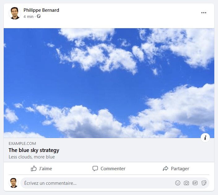
In the <head> section of HTML, we insert a few Open Graph markups:
<meta property="og:title" content="The blue sky strategy" />
<meta property="og:description" content="Less clouds, more blue" />
<meta property="og:image" content="/sky-with-clouds.jpg" />
When we share this page on Facebook, we and our friends see this:
LinkedIn, Twitter, WhatsApp, Slack, Discord, iMessage… All these sites behave pretty much the same way: they provide a visual “card” that accompanies the link, giving it more space and context.
Twitter has its own set of markups with its Twitter Cards, but they are very similar. And Twitter falls back to Open Graph when it can’t find them.
It is natural for our pages to have a title and a description. But in the screenshot above, they are quite small compared to the space and attention the picture of sky and clouds gets — not to mention the size of the clickable area. That’s the power of the social image. It’s easy to understand the impact these images can have when a link is shared.
From Level 0 to Level 3
Not all social images are created equal. These are not official terms, but let’s consider numbered “levels” on how impactful these social image cards can be.
Level 0
The most basic social image is no image. The link might be lost in a sea of content with the small area and not much visual.

Level 1
A classic technique is to create a site-wide social image. While this solution might seem to offer a good outcome-to-effort ratio, one could argue this is worse than no image at all. Sure, we get some attention, but the reaction might be negative, especially if people see a lot of links to this website that all look the same. It risks feeling repetitive and unnecessary.
Level 2
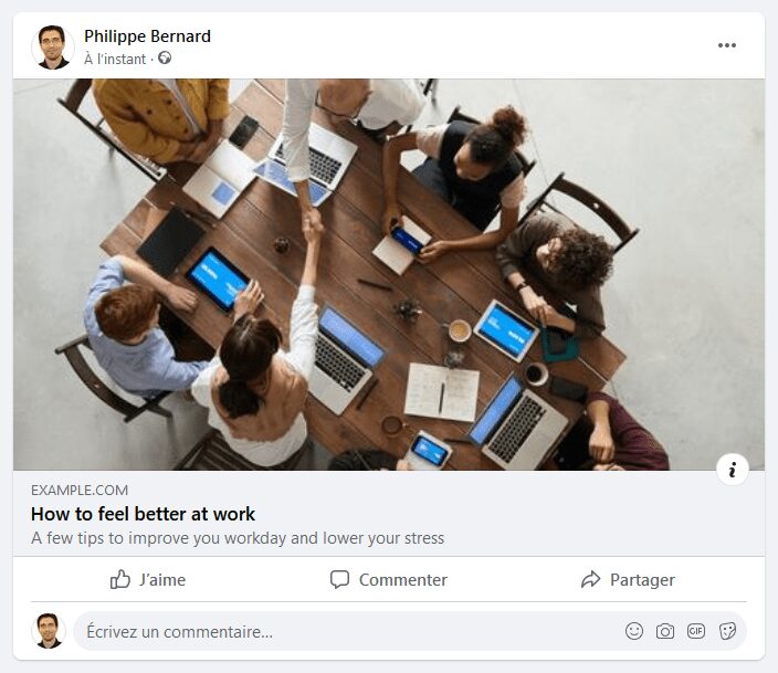
The next level is standard in blogs and media sites: the social image of a post. Each post has its own featured image, and they differ from one post to another. This practice is totally legitimate for a news site, where the photo complements the page content. The potential drawback here is that it requires effort to find and create artwork for each and every published post.
That might lead to a bit of laziness. We’ve all been exposed to images that are obviously stock photos. It might get attention, but perhaps not the kind of attention you actually want.
Level 3
The final level: per-page, content-rich, meaningful social images. CSS-Tricks is doing just this. The team’s social images are branded. They share the same layout. They mention the post title, along with the author’s name and profile picture, something the regular title and description could not show. They grab attention and are memorable.
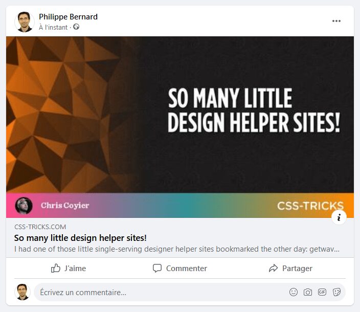
There is an obvious requirement with this approach: automation. It is out of question to create unique images for every possible link. Just think of the overhead. We’d need some programmatic solution to help with the heavy lifting.
Let’s start a blog with blog posts that have unique social images
To give ourselves a nice little excuse (and sandbox) to build out unique social images, we’ll put together a quick blog. When I write and publish an article to this blog, I follow a quick two-step process:
- Write and publish the article
- Post the published URL to my social network accounts
This is when social images must shine. We want to give our blog its best shot at being noticed. But that’s not our only goal. This blog should establish our personal brand. We want our friends, colleagues, and followers to remember us when they see our social posts. We want something that’s repeatable, recognizable, and representative of ourselves.
Creating a blog is a lot of work. Although automated social images are cool, it’s unwise to spend too much time on them. (Chris came to the same conclusion at the end of 2020). So, in the interest of efficiency, we’re making an Eleventy site. Eleventy is a simple static site generator. Instead of starting from scratch, let’s use one of the starter projects. In fact, let’s pick the first one, eleventy-base-blog.
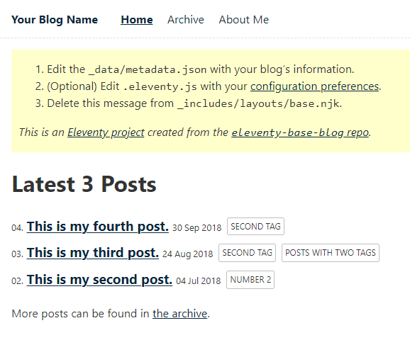
Visit the eleventy-base-blog GitHub page and use it as a template:

Let’s create the repository, and set a repository name, description. We can make it public or private, it doesn’t matter.
Next, we clone our repository locally, install packages, and run the site:
git clone [your repo URL]
cd my-demo-blog ### Or whatever you named it
npm install
npm run serve
Our site running is running at http://localhost:8080.
Now let’s deploy it. Netlify makes this a super quick (and free!) task. (Oh, and spoiler alert: our social images automation relies on a Netlify Function.)
So, let’s go to Netlify and create an account, that is, if you don’t already have one. Either way, create a new site:

Go through the process of allowing Netlify to access the blog repository.
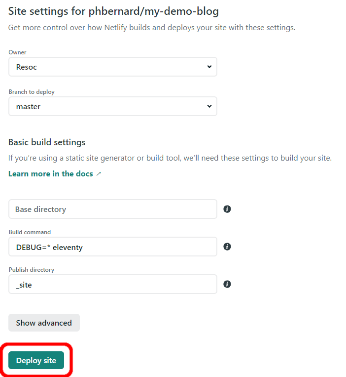
Netlify deploys our site:

After a minute or so, the blog is deployed:
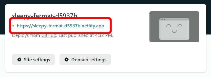
One image template to rule them all
Our social images are going to be based on an image template. To design this template, we are going to use the technologies we already know and love: HTML and CSS. HTML doesn’t turn itself into images auto-magically, but there are tools for this, the most famous being headless Chrome with Puppeteer.
However, instead of building our social image stack ourselves, we use the Resoc Image Template Development Kit. So, from the project root we can run this in the terminal:
npx itdk init resoc-templates/default -m title-descriptionThis command creates a new image template in the resoc-templates/default directory. It also opens up in a new browser window.
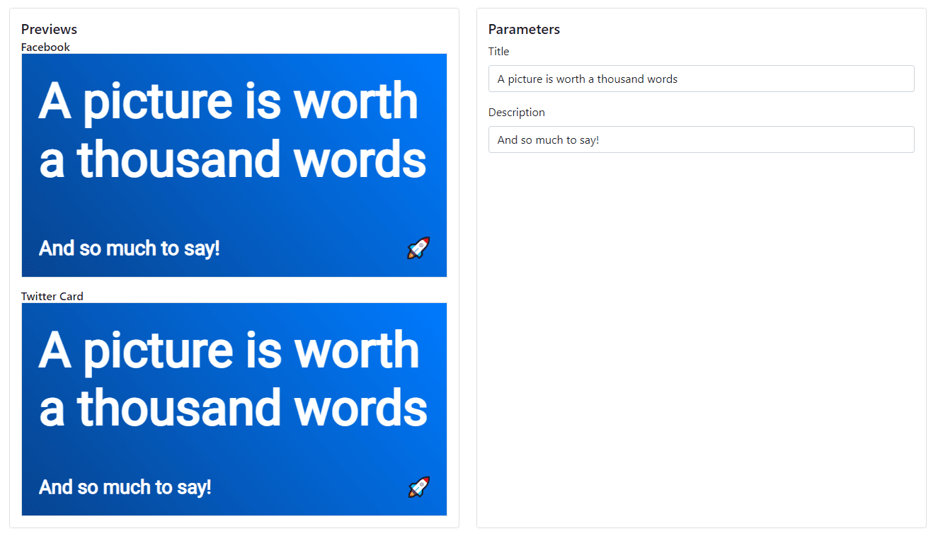
We could use this template as-is, but that only gets us to Level 2 on “impactful” spectrum. What we need to make this go all the way up to Level 3 and match the CSS-Tricks template is:
- the page title aligned to the right with a bit of negative space on the left.
- a footer at the bottom that contains a background gradient made from two colors we are going to use throughout the blog
- the post author’s name and profile picture
If we head back to the browser, we can see in the Parameters panel of the template viewer that the template expects two parameters: a title and description. That’s just the template we chose when we ran -m title-description in the terminal as we set things up. But we can add more parameters by editing resoc-templates/default/resoc.manifest.json. Specifically, we can remove the second parameter to get:
{
  "partials": {
    "content": "./content.html.mustache",
    "styles": "./styles.css.mustache"
  },
  "parameters": [
    {
      "name": "title",
      "type": "text",
      "demoValue": "A picture is worth a thousand words"
    }
  ]
}
The viewer reflects the change in the browser:

It’s time to design the image itself, which we can do in resoc-templates/default/content.html.mustache:
<div class="wrapper">
  <main>
    <h1>{{ title }}</h1>
  </main>
  <footer>
    <img src="profil-pic.jpg" />
    <h2>Philippe Bernard</h2>
  </footer>
</div>
That’s just regular HTML. Well, except {{ title }}. This is Mustache, the templating framework Resoc uses to inject parameter values into the template. We can even type some text in the “Title” field to see it working:

Looking at the previews, notice that we’re missing an image, profil-pic.jpg. Copy your best profile picture to resoc-templates/default/profil-pic.jpg:
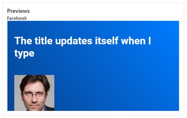
It’s time to write the CSS in resoc-templates/default/styles.css.mustache. The point of this post isn’t how to style the template, but here’s what I ended up using:
@import url('https://fonts.googleapis.com/css2?family=Anton&family=Raleway&display=swap');

.wrapper {
  display: flex;
  flex-direction: column;
}

main {
  flex: 1;
  display: flex;
  flex-direction: column;
  justify-content: center;
  position: relative;
}

h1 {
  text-align: right;
  margin: 2vh 3vw 10vh 20vw;
  background: rgb(11,35,238);
  background: linear-gradient(90deg, rgba(11,35,238,1) 0%, rgba(246,52,12,1) 100%);
  -webkit-text-fill-color: transparent;
  -webkit-background-clip: text;
  font-family: 'Anton';
  font-size: 14vh;
  text-transform: uppercase;
  text-overflow: ellipsis;
  display: -webkit-box;
  -webkit-line-clamp: 3;
  -webkit-box-orient: vertical;
}

h2 {
  color: white;
  margin: 0;
  font-family: 'Raleway';
  font-size: 10vh;
}

footer {
  flex: 0 0;
  min-height: 20vh;
  display: flex;
  align-items: center;
  background: rgb(11,35,238);
  background: linear-gradient(90deg, rgba(11,35,238,1) 0%, rgba(246,52,12,1) 100%);
  padding: 2vh 3vw 2vh 3vw;
}

footer img {
  width: auto;
  height: 100%;
  border-radius: 50%;
  margin-right: 3vw;
}
Most of the sizes rely on vw and vh units to help anticipate the various contexts that the template might be rendered. We are going to follow Facebook’s recommndations, which are 1200×630. Twitter Cards, on the other hand, are sized differently. We could render images in a low resolution, like 600×315, but let’s go with 1200×630 so we we only need to work in pixels.
The viewer renders the Facebook preview at 1200×630 and scales it down to fit the screen. If the preview fulfills your expectations, so will the actual Open Graph images.
So far, the template matches our needs:
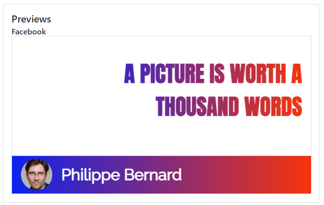
What about the image?
There is one little thing to add before we are done with the template. Some of our blog posts will have images, but not all of them. In situations where a post doesn’t have an image, it would be cool to use the image to fill the space on the left.
This is a new template parameter, so we need to update resoc-templates/default/resoc.manifest.json once again:
{
  "partials": {
    "content": "./content.html.mustache",
    "styles": "./styles.css.mustache"
  },
  "parameters": [
    {
      "name": "title",
      "type": "text",
      "demoValue": "A picture is worth a thousand words"
    },
    {
      "name": "sideImage",
      "type": "imageUrl",
      "demoValue": "https://resoc.io/assets/img/demo/photos/pexels-photo-371589.jpeg"
    }
  ]
}
Let’s declare an additional div in resoc-templates/default/content.html.mustache:
<div class="wrapper">
  <main>
    {{#sideImage}}
    <div class="sideImage"></div>
    {{/sideImage}}
    <h1>{{ title }}</h1>
  </main>
  <footer>
    <img src="profil-pic.jpg" />
    <h2>Philippe Bernard</h2>
  </footer>
</div>
The new {{#sideImage}} ... {{/sideImage}} syntax is a Mustache section. It’s only present when the sideImage parameter is defined.
We need a little extra CSS to handle the image. Notice that we’re able to use the Mustache syntax here to inset the background-image value for a specific post. Here’s how I approached it in the resoc-templates/default/styles.css.mustache file:
{{#sideImage}}
.sideImage {
  position: absolute;
  width: 100%;
  height: 100%;
  background-image: url({{{ sideImage }}});
  background-repeat: no-repeat;
  background-size: auto 150vh;
  background-position: -35vw 0vh;
  -webkit-mask-image: linear-gradient(45deg, rgba(0,0,0,0.5), transparent 40%);
}
{{/sideImage}}
Our template looks great!

We commit our template:
git add resoc-templates
git commit -m "Resoc image template"
Before we automate the social images, let’s generate one manually, just as a teaser. The viewer provides a command line to generate the corresponding image for our testing purposes:
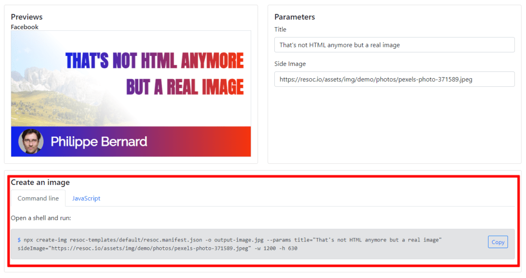
Copy it, run it from a terminal and open output-image.jpg:

Social images automation
OK, so we created one image via the command line. What should we do now? Call it as many times as there are pages on our blog? This sounds like a boring task, and there is a deeper issue with this approach: time. Even if creating a single image took something like two seconds, we can multiply by the number of pages and we easily see the effort grow and grow.
The original Eleventy blog template is generated almost instantly, but we should wait about a minute for something as marginal as social images? This is not acceptable.
Instead of performing this task at build time, we are going to defer it, lazy style, with a Netlify Function and a Netlify on-demand builder. Actually, we aren’t actually dealing directly with a Netlify Function — an Eleventy plugin is going to handle this for us.
Let’s install that now. We can add the Resoc Social Image plugin for Eleventy, along with its companion Netlify plugin, with this command:
npm install --save-dev @resoc/eleventy-plugin-social-image @resoc/netlify-plugin-social-imageWhy two plugins? The first one is dedicated to Eleventy, while the second one is framework-agnostic (for example, it can be used for Next.js).
Edit .eleventy.js at the root of the project so that we’re importing the plugin:
const pluginResoc = require("@resoc/eleventy-plugin-social-image");Configure it near the top of .eleventy.js, right after the existing eleventyConfig.addPlugin:
eleventyConfig.addPlugin(pluginResoc, {
  templatesDir: 'resoc-templates',
  patchNetlifyToml: true
});
templatesDir is where we stored our image template. patchNetlifyToml is asking the plugin to configure @resoc/netlify-plugin-social-image in netlify.toml for us.
We want all our pages to have automated social images. So, let’s open the master template, _includes/layouts/base.njk, and add this near the top of the file:
{% set socialImageUrl %}
{%- resoc
  template = "default",
  slug = (title or metadata.title) | slug,
  values = {
    title: title or metadata.title,
    sideImage: featuredImage
  }
-%}
{% endset %}
This declares a new variable named socialImageUrl. The content of this variable is provided by the resoc short code, which takes three parameters:
- The
templateis the sub directory of our template (it is inresoc-templates/default). - The
slugis used to build the social image URL (e.g./social-images/brand-new-post.jpg). We slug-ify the page title to provide a unique and sharable URL. - The
valuesare the content, as defined inresoc-templates/default/resoc.manifest.json.titleis obvious, because pages already have a title.sideImageis set to a meta namedfeaturedImage, which we are going to define for illustrated pages.
Now we can open up _includes/layouts/base.njk, place our cursor in the <head>, add some new markup to populate all that stuff
<meta property="og:title" content="{{ title or metadata.title }}"/>
<meta property="og:description" content="{{ description or metadata.description }}"/>
<meta property="og:image" content="{{ socialImageUrl }}"/>
<meta property="og:image:width" content="1200"/>
<meta property="og:image:height" content="630"/>
The title and description markups are similar to the existing <title> and <meta name="description">. We’re using socialImageUrl as-is for the og:image meta. We also provide the social image dimensions to round things out.
Automated social images are ready!
Let’s deploy this
When we deploy the blog again, all pages will show the text-only version of our template. To see the full version , we assign an image to an existing page. that requires us to edit one of the posts — I created four posts and am editing the fourth one, posts/fourthpost.md — so there’s a featuredImage entry after the existing meta:
---
title: This is my fourth post.
description: This is a post on My Blog about touchpoints and circling wagons.
date: 2018-09-30
tags: second tag
layout: layouts/post.njk
featuredImage: https://resoc.io/assets/img/demo/photos/pexels-pixabay-459653.jpg
---
Using an external URL is enough here, but we normally drop images in an img directory with Eleventy and provide the base URL once and for all in _includes/layouts/base.njk.
Build the site again:
npm run buildWhen running git status, we might notice two modified files in addition to the ones we edited ourselves. In .gitignore, the plugin added resoc-image-data.json. This file stores our social image data used internally by the Netlify plugin, and netlify.toml now contains the Netlify plugin configuration.
Deploy time!
git commit -a -m "Automated social images"
git push
Netlify is notified and deploys the site. Once the latest version is online, share the homepage somewhere (e.g. Slack it to yourself or use the Facebook debugger). Here’s how the social card looks for the homepage, which does not contain an image:
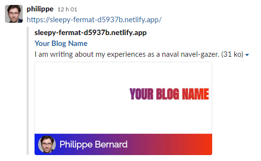
And here’s how it looks for a post that does contain an image:
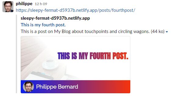
Perfect!
Conclusion
So far, automated social images have mostly been a matter of developers willing to explore and play around with lots of different ideas and approaches, some easy and some tough. We kept things relatively simple.
With a few lines of code, we were able to quickly setup automated social images on a blog based on Eleventy and hosted on Netlify. The part we spent the most time on was the image template, but that’s not a problem. With the viewer and Mustache already integrated, we focused on what we know, love, and value: web design.
Hopefully something like the Resoc image template dev kit and its related tools will help make the automated social images go from being a niche hobby into the mainstream.
