I was working on a large React application for a startup, and aside from just wanting some good strategies to keep our styles organized, I wanted to give this whole “dark mode” thing a shot. With the huge ecosystem around React, you might think that there would be a go-to solution for style themes, but a little web searching shows that really isn’t the case.
There are plenty of different options out there, but many of them tie into very specific CSS strategies, like using CSS Modules, some form of CSS-in-JS, etc. I also found tools specific to certain frameworks, like Gatsby, but not a generic React project. What I was looking for was a basic system that’s easy to set up and work with without jumping through a ton of hoops; something fast, something easy to get a whole team of front-end and full-stack developers onboarded with quickly.
The existing solution I liked the best centered around using CSS variables and data attributes, found in this StackOverflow answer. But that also relied on some useRef stuff that felt hack-y. As they say in every infomercial ever, there’s got to be a better way!
Fortunately, there is. By combining that general CSS variable strategy with the beautiful useLocalStorage hook, we have a powerful, easy-to-use theming system. I’m going to walk through setting this thing up and running it, starting from a brand new React app. And if you stick around to the end, I also show you how to integrate it with react-scoped-css, which is what makes this my absolutely preferred way to work with CSS in React.
Project setup
Let’s pick this up at a very good place to start: the beginning.
This guide assumes a basic familiarity with CSS, JavaScript, and React.
First, make sure you have a recent version of Node and npm installed. Then navigate to whatever folder you want your project to live in, run git bash there (or your preferred command line tool), then run:
npx create-react-app easy-react-themes --template typescriptSwap out easy-react-themes with the name of your project, and feel free to leave off the --template typescript if you’d rather work in JavaScript. I happen to like TypeScript but it genuinely makes no difference for this guide, other than files ending in .ts/.tsx vs .js/.jsx.
Now we’ll open up our brand new project in a code editor. I’m using VS Code for this example, and if you are too, then you can run these commands:
cd easy-react-themes
code .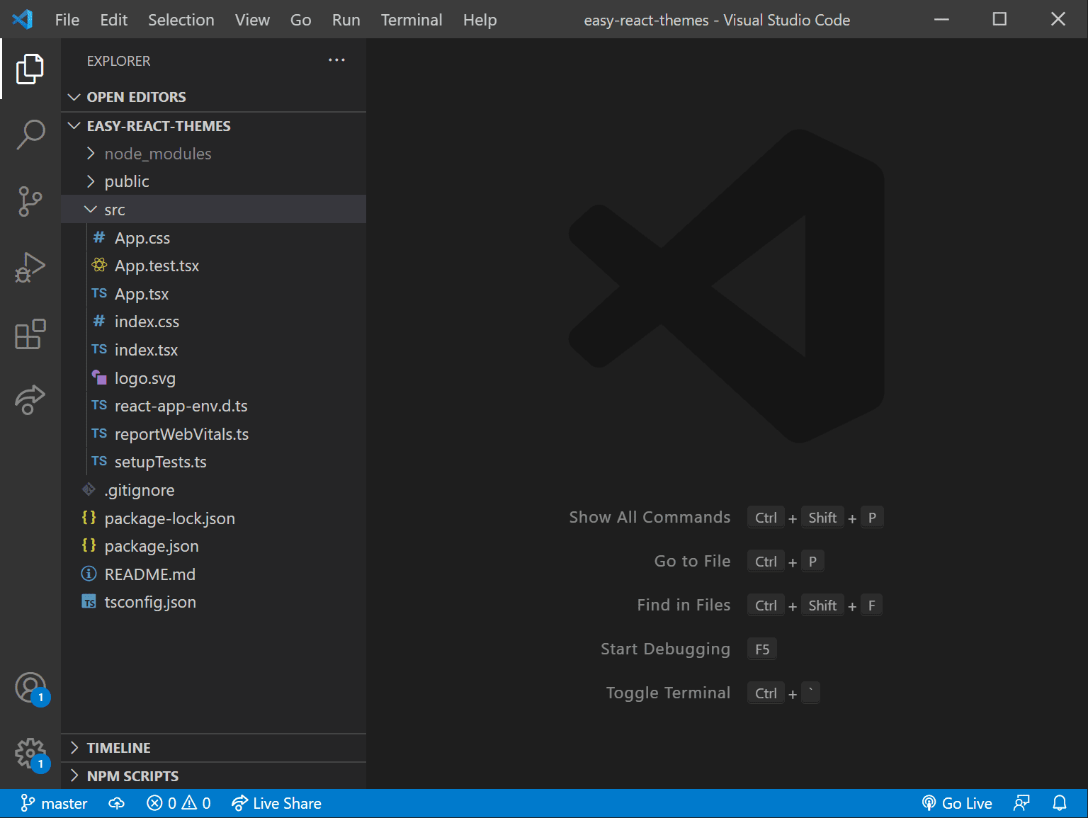
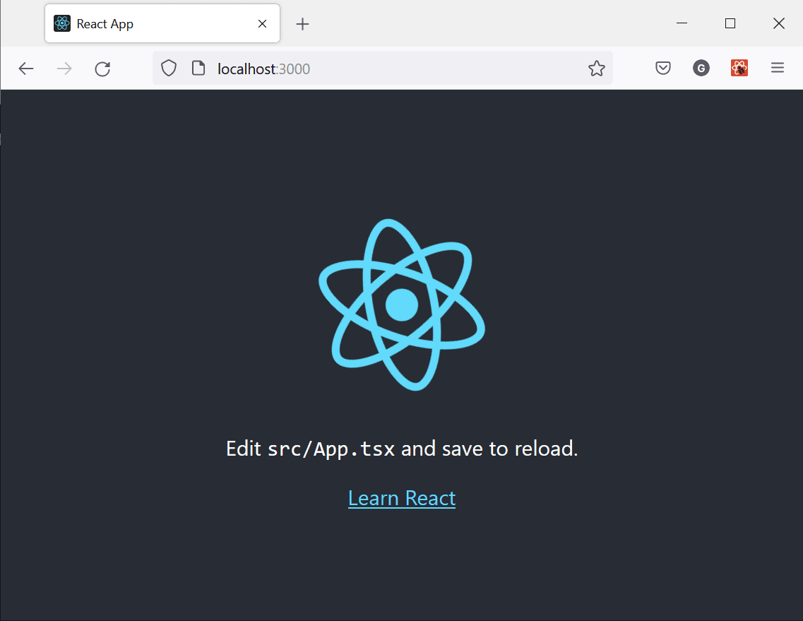
Running npm start next starts your development server, and produces this in a new browser window:
And, finally, go ahead and install the use-local-storage package with:
npm i use-local-storageAnd that’s it for the initial setup of the project!
Code setup
Open the App.tsx file and get rid of the stuff we don’t need.
Delete the entire content in App.css:
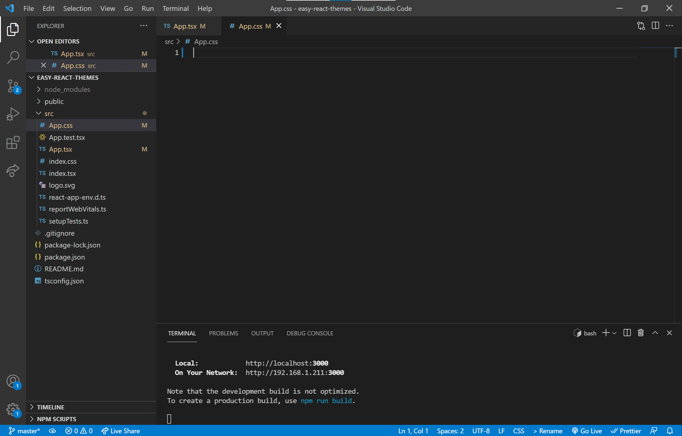
Woot! Now let’s create our themes! Open up the index.css file and add this to it:
:root {
  --background: white;
  --text-primary: black;
  --text-secondary: royalblue;
  --accent: purple;
}
[data-theme='dark'] {
  --background: black;
  --text-primary: white;
  --text-secondary: grey;
  --accent: darkred;
}
Here’s what we have so far:
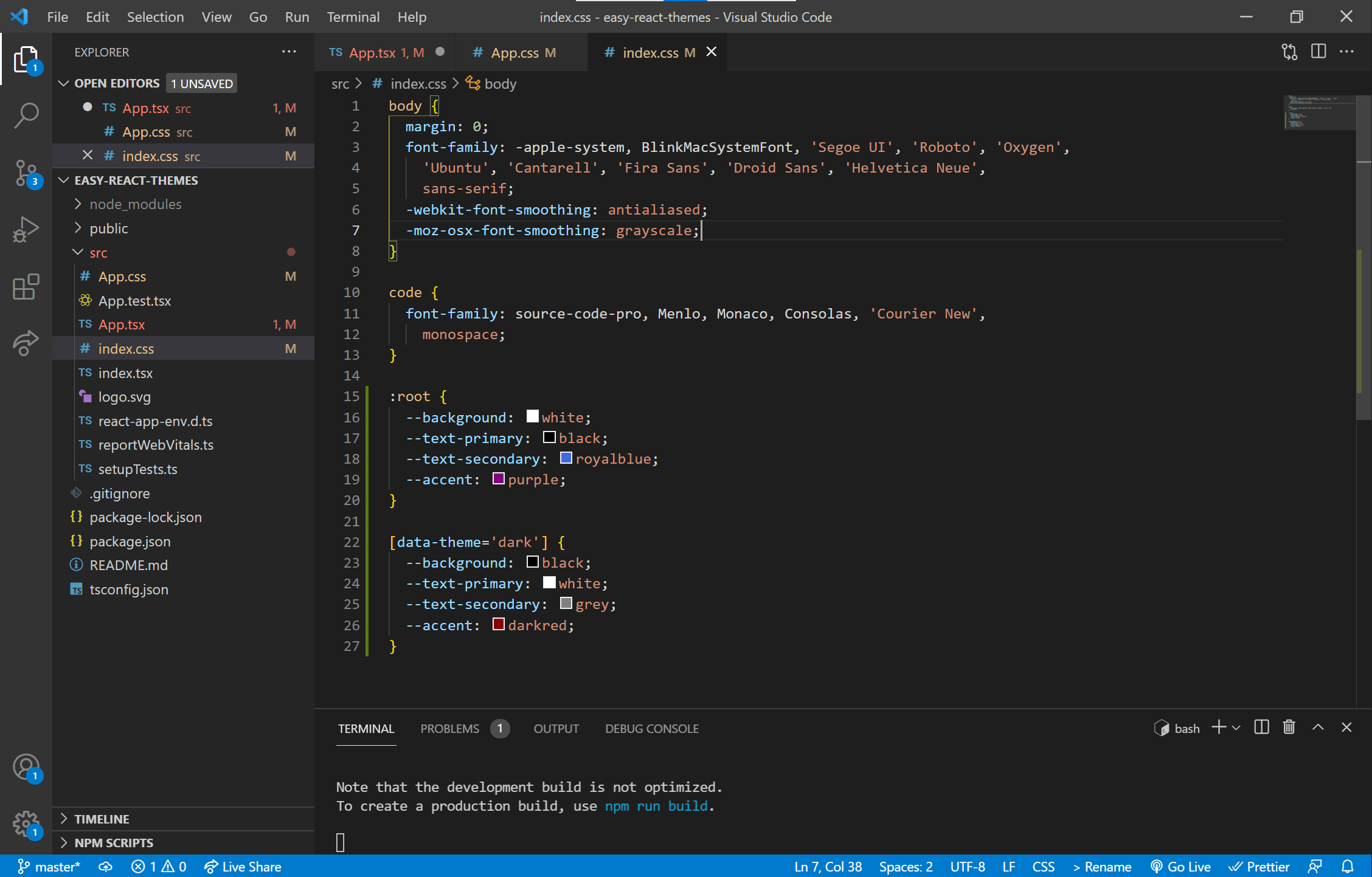
See what we just did there? If you’re unfamiliar with CSS Custom Properties (as also known as CSS variables), they allow us to define a value to be used elsewhere in our stylesheets, with the pattern being --key: value. In this case, we’re only defining a few colors and applying them to the :root element so they can be used be used wherever else we need them across the whole React project.
The second part, starting with [data-theme='dark'], is where things get interesting. HTML (and JSX, which we’re using to create HTML in React) allows us to set completely arbitrary properties for our HTML elements with the data-* attribute. In this case, we are giving the outermost <div> element of our application a data-theme attribute and toggling its value between light and dark. When it’s dark, the CSS[data-theme='dark'] section overrides the variables we defined in the :root, so any styling which relies on those variables is toggled as well.
Let’s put that into practice. Back in App.tsx, let’s give React a way to track the theme state. We’d normally use something like useState for local state, or Redux for global state management, but we also want the user’s theme selection to stick around if they leave our app and come back later. While we could use Redux and redux-persist, that’s way overkill for our needs.
Instead, we’re using the useLocalStorage hook we installed earlier. It gives us a way to store things in local storage, as you might expect, but as a React hook, it maintains stateful knowledge of what it’s doing with localStorage, making our lives easy.
Some of you might be thinking “Oh no, what if the page renders before our JavaScript checks in with localStorage and we get the dreaded “flash of wrong theme?” But you don’t have to worry about that here since our React app is completely rendered client-side; the initial HTML file is basically a skeleton with a with a single <div> that React attaches the app to. All of the final HTML elements are generated by JavaScript after checking localStorage.
So, first, import the hook at the top of App.tsx with:
import useLocalStorage from 'use-local-storage'Then, inside our App component, we use it with:
const defaultDark = window.matchMedia('(prefers-color-scheme: dark)').matches;
const [theme, setTheme] = useLocalStorage('theme', defaultDark ? 'dark' : 'light');
This does a few things for us. First, we’re checking if the user has set a theme preference in their browser settings. Then we’re creating a stateful theme variable that is tied to localStorage and the setTheme function to update theme. useLocalStorage adds a key:value pair to localStorage if it doesn’t already exist, which defaults to theme: "light", unless our matchMedia check comes back as true, in which case it’s theme: "dark". That way, we’re gracefully handling both possibilities of keeping the theme settings for a returning user, or respecting their browser settings by default if we’re working with new users.
Next, we add a tiny bit of content to the App component so we have some elements to style, along with a button and function to actually allow us to toggle the theme.
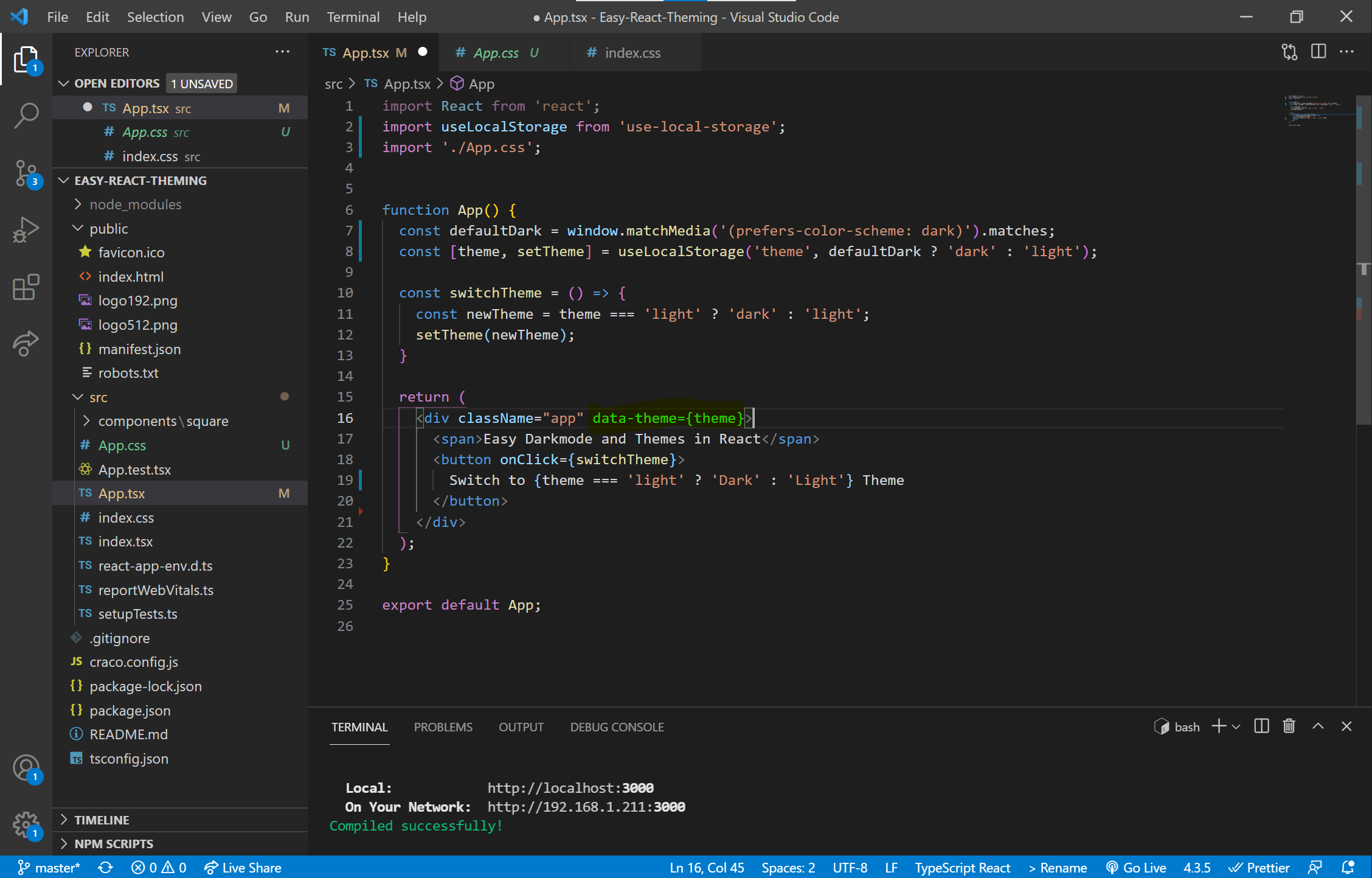
App.tsx fileThe secret sauce is on line 14 where we’ve added data-theme={theme} to our top-level <div>. Now, by switching the value of theme, we are choosing whether or not to override the CSS variables in :root with the ones in the data-mode='dark' section of the index.css file.
The last thing we need to do is add some styling that uses those CSS variables we made earlier, and it’ll up and running! Open App.css and drop this CSS in there:
.App {
  color: var(--text-primary);
  background-color: var(--background);
  font-size: large;
  font-weight: bold;
  padding: 20px;
  height: calc(100vh - 40px);
  transition: all .5s;
}
button {
  color: var(--text-primary);
  background-color: var(--background);
  border: 2px var(--text-primary) solid;
  float: right;
  transition: all .5s;
}
Now the background and text for the main <div>, and the background, text, and outline of the <button> rely on the CSS variables. That means when the theme changes, everything that depends on those variables update as well. Also note that we added transition: all .5s to both the App and <button> so for a smooth transition between color themes.
Now, head back to the browser that’s running the app, and here’s what we get:
Tada! Let’s add another component just to show how the system works if we’re building out a real app. We’ll add a /components folder in /src, put a /square folder in /components, and add a Square.tsx and square.css, like so:
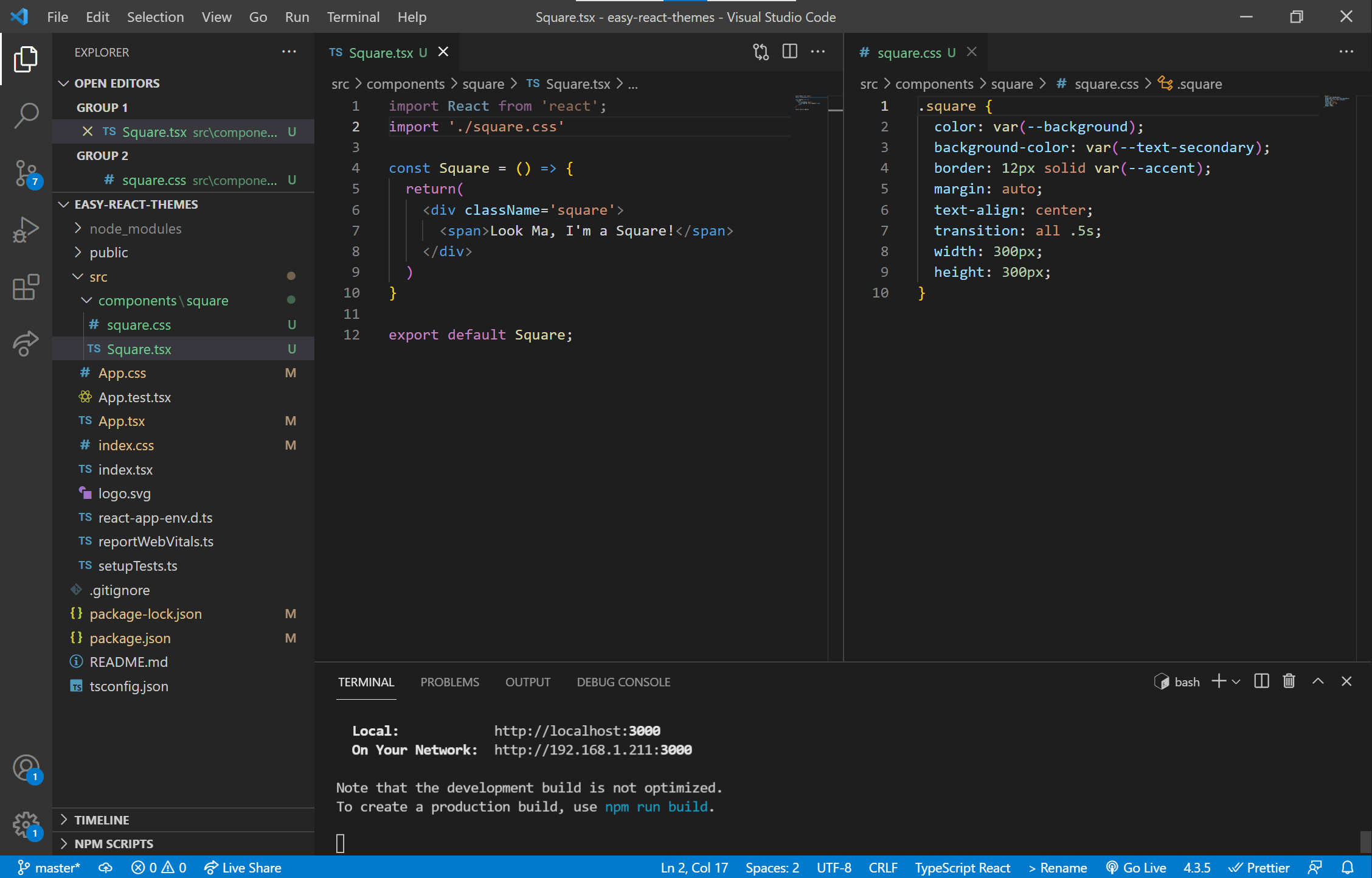
Let’s import it back into App.tsx, like so:
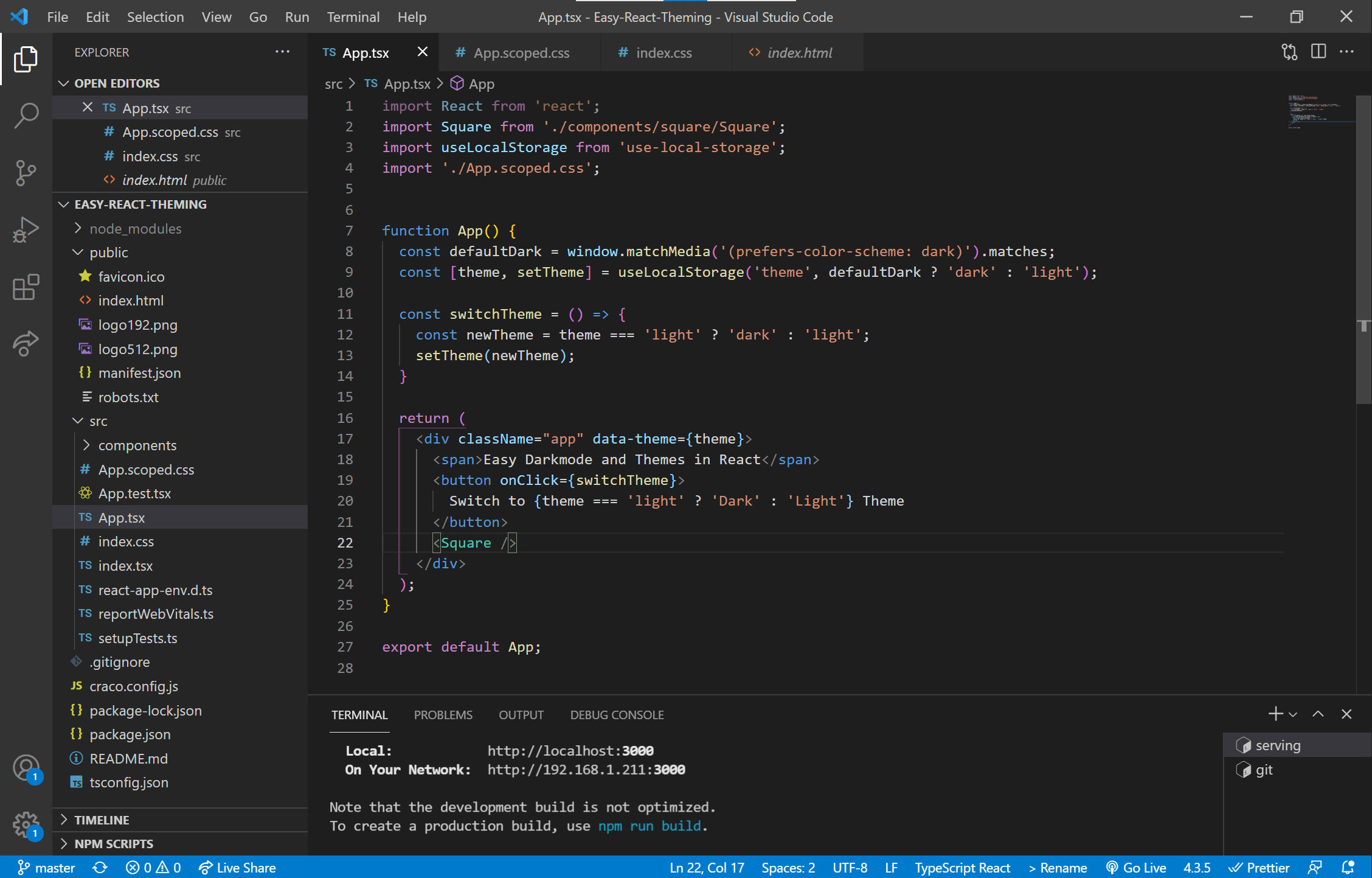
Here’s what we have now as a result:
And there we go! Obviously, this is a pretty basic case where we’re only using a default (light) theme, and a secondary (dark) theme. But if your application calls for it, this system could be used to implement multiple theme options. Personally, I’m thinking of giving my next project options for light, dark, chocolate, and strawberry—go nuts!
Bonus: Integrating with React Scoped CSS:
Using React Scoped CSS is my favorite way to keep each component’s CSS encapsulated to prevent name collision messiness and unintended style inheritance. My previous go-to for this was CSS Modules, but that has the downside of making the in-browser DOM look like a robot wrote all of the class names… because that’s exactly the case. This lack of human-readability makes debugging far more annoying than it has to be. Enter React Scoped CSS. We get to keep writing CSS (or Sass) exactly the way we have been, and the output looks like a human wrote it.
Seeing as the the React Scoped CSS repo provides full and detailed installation instructions, I’ll merely summarize them here.
First, install and configure Create React App Configuration Override (CRACO) according to their instructions. Craco is a tool that lets us override some of the default webpack configuration that’s bundled into create-react-app (CRA). Normally, if you want to adjust webpack in a CRA project, you first have to “eject” the project, which is an irreversible operation, and makes you fully responsible for all of the dependencies that are normally handled for you. You usually want to avoid ejecting unless you really, really know what you’re doing and have a good reason to go down that road. Instead, CRACO let’s us make some minor adjustments to our webpack config without things getting messy.
Once that’s done, install the React Scoped CSS package:
npm i craco-plugin-scoped-css(The README instructions use yarn for installation instead of npm, but either is fine.) Now that it’s installed, simply rename the CSS files by adding .scoped before the .css, like so:
app.css -> app.scoped.cssAnd we need to make sure we’re using a new name when importing that CSS into a component:
import './app.css'; -> import './app.scoped.css';Now all of the CSS is encapsulated so that it only applies to the components they’re imported into. It works by using data-* properties, much like our theme system, so when a scoped CSS file is imported into a component, all of that component’s elements are labeled with a property, like data-v-46ef2374, and the styles from that file are wrapped so that they only apply to elements with that exact data property.
That’s all wonderful, but the little trick to making that work with this theming system is that we explicitly don’t want the CSS variables encapsulated; we want them applied to the whole project. So, we simply don’t change index.css to have scoped in it… in other words, we can leave that CSS file alone. That’s it! Now we have a powerful theming system working in harmony with scoped CSS— we’re living the dream!
Thank you so much taking a read through this guide, and if it helped you build something awesome, I would love to know about it!
The post Easy Dark Mode (and Multiple Color Themes!) in React appeared first on CSS-Tricks. You can support CSS-Tricks by being an MVP Supporter.


