Designing Human-Machine Interfaces For Vehicles Of The Future
Nick Babich & Gleb KuznetsovA human-machine interface (HMI) is an interface that allows us to interact with a digital system. No matter what HMI we design, we need to allow users to take advantage of all that a system has to offer. For almost two decades, the personal computer was the first thing that came to mind when we heard about digital HMI. But the situation changed, and today HMI is an integral part of many devices we use daily — mobile phones, smartwatches, IoT devices, and even cars. Car HMI design is a relatively new field with its specifics that you need to be aware of.
My team has experience designing for major automotive companies like Mercedes-Benz and Mitsubishi, and we want to share some practical experience in this article. This article covers HMI car design, touching on why it is an essential aspect of car design.
What Is HMI?
Car HMI is a collection of functional elements (such as head unit, instrument cluster, and head-up display (HUD) as well as interaction mediums (touch, voice, haptic) that allow turning the vehicle into a living space.
Brief History Of Digital HMI
Digital HMI as we know them was initially introduced in the early 80s. At that time, the number of features that a regular vehicle was capable of doing was rising rapidly, and one of the tasks that designers had was to provide controls that allowed drivers to manage the new functionality. Designers follow two different approaches: some of them use analog controls (they add a physical button for each feature) while others add a screen with dynamic content.
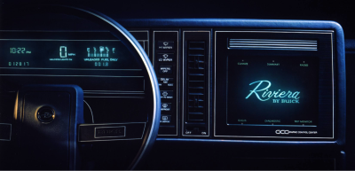
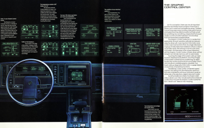
The first approach was popular among German car manufacturers, while the second was popular among American and Japanese car manufacturers. One of the earliest examples of such systems was introduced in the 1986 Buick Riviera. This system allows users to control radio stations and climate using the monochromatic touchscreen display. It’s quite clear that the design of this system was inspired by the aircraft.
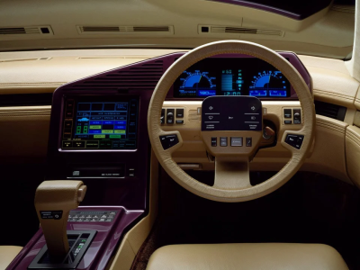
Another noticeable example is Nissan’s CUE-X Concept introduced in 1985. The system offered colored touch screens with nice graphics. As you can see, the design and location of functional controls are very similar to modern vehicles.
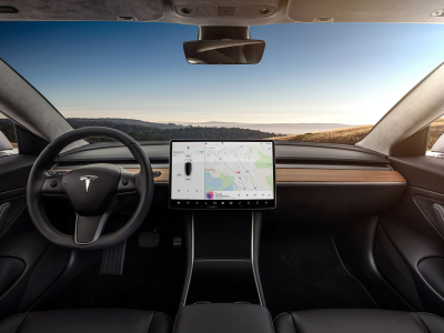
The modern HMI is a mix of a car control center with an entertainment system. It allows users to change climate settings, find a route to a particular destination or watch YouTube videos.
More after jump! Continue reading below ↓
Benefits Of Using Digital HMI
Digital HMI just recently became a mass-market technology. Just a few years ago, HMI was a prerogative of luxury vehicles. What is the reason why many car manufacturers suddenly decided to introduce displays in their vehicles?
The primary reason is money. It’s much easier to integrate a display in a cockpit and update the software once you see whether something works or doesn’t work for your users (similar to mobile phones) rather than design a set of physical controls and have to redesign it completely if something went wrong.
Another reason is market expectations — users expect to see HMI in the car they purchase today.
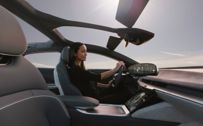
But those are market reasons, what about human needs? HMI has tremendous power to improve the user experience of drivers and passengers.
Here are just a few areas where HMI can be valuable:
- Help drivers make informed decisions.
HMI can provide real-time data to users in an easy-to-consume manner. Take electric vehicles, for example. A driver might be able to see just how much energy was used up in real-time based on how hard they accelerated the vehicle. - Can contribute to a safer driving experience.
HMI can inform drivers about dangerous conditions (i.e. when the vehicle is close to the lane limit) and prevent driving collisions (i.e. slow down the car to avoid car accidents). - More natural interaction between the driver and the car.
HMI can establish a more natural interaction between humans and machines. For example, a voice-based system can allow drivers to use natural words to give commands to the car.
What To Focus On When Designing A Digital HMI
Based on my experience, designing a beautiful and effective HMI requires looking at artistry and functionality as one. Artistry and functionality should be equals, working together in perfect harmony to immerse users in the experience.
Here are a few essential design principles I want to share with you:
Give Users A Sense Of Control
One of the ten usability heuristics for UI design coined by Jakob Nielsen says,
“The design should always keep users informed about what is going on, through appropriate feedback within a reasonable amount of time.”
This heuristic applies to any digital system, including HMI design for vehicles. HMI should always inform users about the current status through appropriate feedback within a reasonable amount of time. It is especially important when a user is driving, and no actions with consequences to users should be taken without informing them.
Even when a car avoids an accident, it should inform the user what is happening (for example, by showing a visual alert with sound):
Follow The “Safety First” Approach
As I’ve mentioned above, the primary benefit of HMI systems is that they help us save lives. Modern cars are equipped with a lot of sensors and it’s possible for sensors to collect information, then use that information to track driving conditions. At the end of the day, the system can monitor real-time situations and prevent traffic collisions and accidents. The system response to conditions can be:
- Reactive
The system informs the driver about what just happened, such as low tire pressure or microsleep (eyelids get heavy), and alerts the driver about that. - Proactive
The system can analyze conditions, predict what might happen, and warn a driver about potentially bad circumstances. For example, the system analyses weather conditions and suggests users avoid taking a car on a day when roads will be covered with ice.
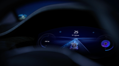
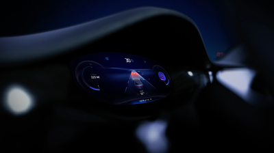
When you design the system response, it’s critical not to overwhelm users with a lot of information. It’s crucial to craft a solid notification strategy. All updates that you send to the user should be:
- Valuable
Users should see only updates that they care about. - Timely
Updates should be sent to the user exactly when they need them. - Clear
Users should be able to understand what the update is all about. It’s important to rely on chunking and gestalt principles when you design information messages. The easier it’s for users to scan them the better it is for safety.
Minimize Cognitive Load
Cognitive load is the amount of brain power required to use the system. When a system demands a lot of cognitive load from users, it is typically a clear indication that there is an opportunity to improve system design. There are a few things you can do to minimize cognitive load.
First, don’t force users to remember information about driving conditions. It’s a known fact that people cannot keep a lot of information in their working memory. You need to design a system in a way that answers all key questions that users might have while they’re driving:
- What is the temperature in the cabin?
- What am I listening to right now?
- Where am I going to?
Designers need to provide this information upfront in the instrument cluster.
Second, it’s crucial to build your HMI based on existing mental models. People already have mental models about how HMIs work, based on their past experiences interacting with other cars. When you follow conventional design principles, you minimize the effort required to learn how to use your system.
Reduce Unnecessary Distraction
Over a decade ago, the National Safety Council found that mobile phone use while driving leads to 1.6 million crashes annually. Imagine that number today, in a world where mobile devices have only grown in importance. That’s why one of the goals that carmakers have is to make users interact with an HMI instead of their phones.
HMI should serve as a complete replacement for your mobile phone while you’re driving. You shouldn’t have any reason to glance at your phone because HMI should be capable of doing the same things your mobile phone is doing. You might argue that the large display of the HMI system will attract a lot of attention and have a similar impact as mobile phones have now. In reality, the way we design a system matters. I believe that voice — not touch — should be the primary medium of interaction with the system. The goal is to define a core set of tasks that a user might want to complete with the system (i.e. changing radio stations, updating climate preferences, sending a message to a friend, and so on) and design scenarios where users can do that with voice alone, to satisfy this need.
The great thing about designing voice-based interactions is that you can test your solution without building an actual system. The Wizard of Oz method can help you test your script and find areas where you can do better.
Help Users With Daily Routine
What motivates people to start using new products? While there are many reasons why people do what they do, the primary motivator is efficiency. People begin using a particular product because they believe it will help them achieve their goal (or goals) much easier. The same principle applies to the HMI system.
If you live in major metropolitan areas, you know how hard it is to find a parking lot during the business week. In San Francisco, you can spend up to an hour finding a spot in the downtown area. It’s not the most exciting routine. How to make it better? The answer is simple — allow the car to find a place itself.
Modern navigation systems can provide up-to-date information about free parking lots, so when we design HMI, we can use this information to guide the driver to the spot.
So, how to find a solution for daily operations? One promising approach is to rely on “How might we…” techniques. Once you define a routine task you want to help users with, you can ask questions like, “How might we help users solve this problem?” and propose a list of ideas. It is an ideal technique for brainstorming sessions with your team — collect all responses from your co-creators, and vote for the best solution together.
Another question you might have here: How can we incorporate this into HMI design? Well, first of all, operations that the system is capable of doing are called skills. There are two ways users can activate a skill: either do it manually (i.e. click on “Navigation app” to find a route to the paid parking lot) or the skill can be activated automatically (i.e. a system understand the user is looking for parking and offers relevant suggestion). Ideally, the system should learn about user needs and habits and predict when the user will need help.
Recently, car manufacturers have started to introduce augmented reality experience in the cars they make. For example, the 2022 Mercedes S-Klasse features a head-up display that projects graphics directly onto its windshield. By doing that, car manufacturers provide the important information in the context of interaction.
Self-Evident Navigation Experience
Users should be able to find relevant skills with ease. Discoverability (ability to find a specific area in a system) and navigation experience (ability to navigate to that area) should be on the top level. Many modern cars suffer from situations where users have to make dozens of taps to do what they want to do.
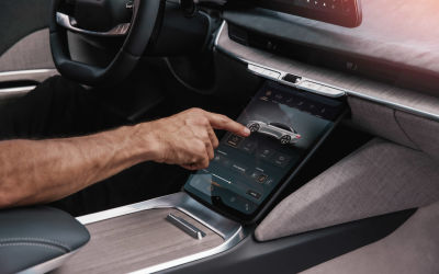
It’s possible to avoid situations like that by carefully planning the information architecture of your system. First, you need to define areas that users will navigate (i.e. vehicle settings such as suspension, climate control, entertainment system, and so on). Such areas will have the role of navigation hubs where users can dive into more detailed info. After that, you need to distribute relevant skills between them and ensure that users can navigate to the skill in no more than three taps (yes, the Three-Click Rule still works).
For example, when a user wants to change comfort seeints (i.e. turn on seat massage), they should be able to do it in a three or less clicks on the touch display or one voice command:
The System Constantly Learns About You And Your Preferences
A lot of articles were written about the importance of creating products that aim to personalize the experience. Yet, we don’t have too many products on the market that actually make it possible.
The sad fact is that many modern HMI do not offer personalization, they offer customization. These systems simply allow users to modify some preferences. But it’s a weak solution since most users don’t change default settings even when the system allows that. When it comes to HMI design, you have an opportunity to create a more comfortable driving experience for users if you consider their personal preferences.
Let me give you a couple of examples where learning about user behavior can improve user experience:
- Climate Control
The system selects the proper temperature for the user and ensures that the user feels comfortable by asking the user. On a winter day, the system asks users “Are you warm enough?” The user might respond with “I like warmer” The system will adjust the temperature and remember this selection. - Music, Places And Events
The system knows user preferences and can suggest content, places, or events that the user likes. For example, the system can suggest new music tracks that match the user preferences. - Comfort
When the system notices that the user is turning seat massage on specific conditions (i.e. after a long workday, during the long-range, etc.), the system can turn it on automatically and notify the user about that (i.e. “For your comfort, I’ve turned on the classic massage”). Selecting a massage option is one of the tedious tasks in modern cars, and such intelligent automation can be beneficial for users.
At the end of the day, we will have a system tailored to the needs of a particular user. And this will give us a significant competitive advantage — better user engagement and a higher level of trust. When we know that the system understands us and offers relevant recommendations, we are more willing to use it for a longer period.
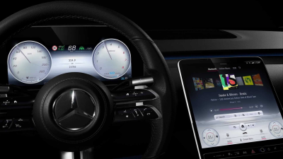
Inviting Visual Language
If you ask me to define a pyramid of user needs, I will start give you the following layers:
- Functional,
- Reliable,
- Usable,
- Pleasurable.
Only when you design a system that has the first three layers can you make it pleasurable. But what does pleasurable mean when it comes to design? I think that pleasure is how the system makes you feel. Even a system that doesn’t have any visual design can make you feel good.
But when it comes to car HMI design, designers have a fantastic opportunity to use their skills to create an impressive solution.
“One second of emotion can change the whole reality for people engaging with a product.”
— Gleb Kuznetsov
The Aesthetic-Usability Effect states that users tend to perceive attractive products as more usable. Designers have to build identity and character into the visual language they use to communicate with users. By improving the system’s visual aspect, we improve how the system is perceived.
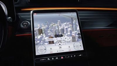
For example, you can design a realistic 3D rendering for navigation that will help users faster understand the context (where they’re now and where they are going) and be a superb first-time experience. Imagine you as a user triggers this for the first time; this likely positively impacts you.
When you validate your HMI, you shouldn’t measure only task competition time and the number of errors. You should always measure user satisfaction. It’s important to ask questions “How does this design make you feel?” when you conduct usability testing with real or potential users. If you find that the user doesn’t feel good about your design, you can ask more specific questions to identify areas for improvement.
Conclusion
Modern HMIs are transforming the way we interact with our vehicles. A car becomes a gadget that we use in a similar way as we use our phones. Users expect a lot of HMI, they even evaluate car experience based on the experience they have with HMI. And it’s up to designers to satisfy those needs with proper design.
So, the next time you design HMI system you need to ensure that it satisfies following criteria:
- Gives users a sense of control;
- Offers good learnability;
- No or minimal distraction from driving;
- Constantly learns user preferences and suggest changes proactively;
- Sparks positive emotional response from users.