This month we’re seeing websites that are very conscious of the design trends they’re following. Web designers are making conscious choices to adopt styles, and opting out when it doesn’t suit the site. What we end up with is a crop of sophisticated, well-designed websites that use style as a technique to further their aims.
Here are the sites that caught our eye this month, enjoy!
Seen
Seen uses conversations to explore themes surrounding ethnicity and racism in creative fields. Displaying these conversations as online chats creates a sense of intimacy.

Baboon to the Moon
There is a lot of colour in Baboon to the Moon’s product shots, so the rest of the site is kept simple, with good clear navigation too.

Fleava
There is a strong sense of luxury in the digital marketing agency Fleava’s glossy brochure portfolio site.

Baunfire Portfolio Review 2024
This site for Baunfire Digital Agency’s creative networking event is bold, personable, and fun.

Laesk Kombucha
There is more than a touch of Wes Anderson’s style to this site for Laesk Kombucha; somewhere just out of sight is Bill Murray in a red beanie.

Viso Haus
Viso Haus doesn’t do anything hugely groundbreaking here with their brutal-style portfolio site, but they do it very well.

Mario Carillo
Artist/programmer Mario Carillo has opted for a minimal approach, allowing the work to do the talking.

Symbol
There is a warmth to Symbol’s site, created by the colour tones and combinations used here.

Contekst
Interior architects Contekst favour a brutalist visual style for their site, but with some nice little animated extras.

Arcane Type Fair
No, you haven’t missed the font lover’s answer to Comic Con: the Arcane Type Fair is fictitious and a clever showcase for Rain Foundry’s Conacher typeface.

Capsul’in Pro
With lovely scrolling animation and soothing colours, this site for Capsul’in Pro manages to turn coffee pods into objects of desire.

Wanderful Chalet
Random illustrations and a quirky display type add character to Wanderful Chalet’s brochure site.

Stone Cycling
Bricks made from rubbish don’t sound like the most exciting thing ever, but this site evokes a lovely clean feel: like an old building gleaming in the sunlight after all the soot has been scraped off it.

Lazarus Forms
Lazarus Forms is an API for AI document processing. This site succeeds in being transparent in its explanation without being overly technical and pleasing visually.

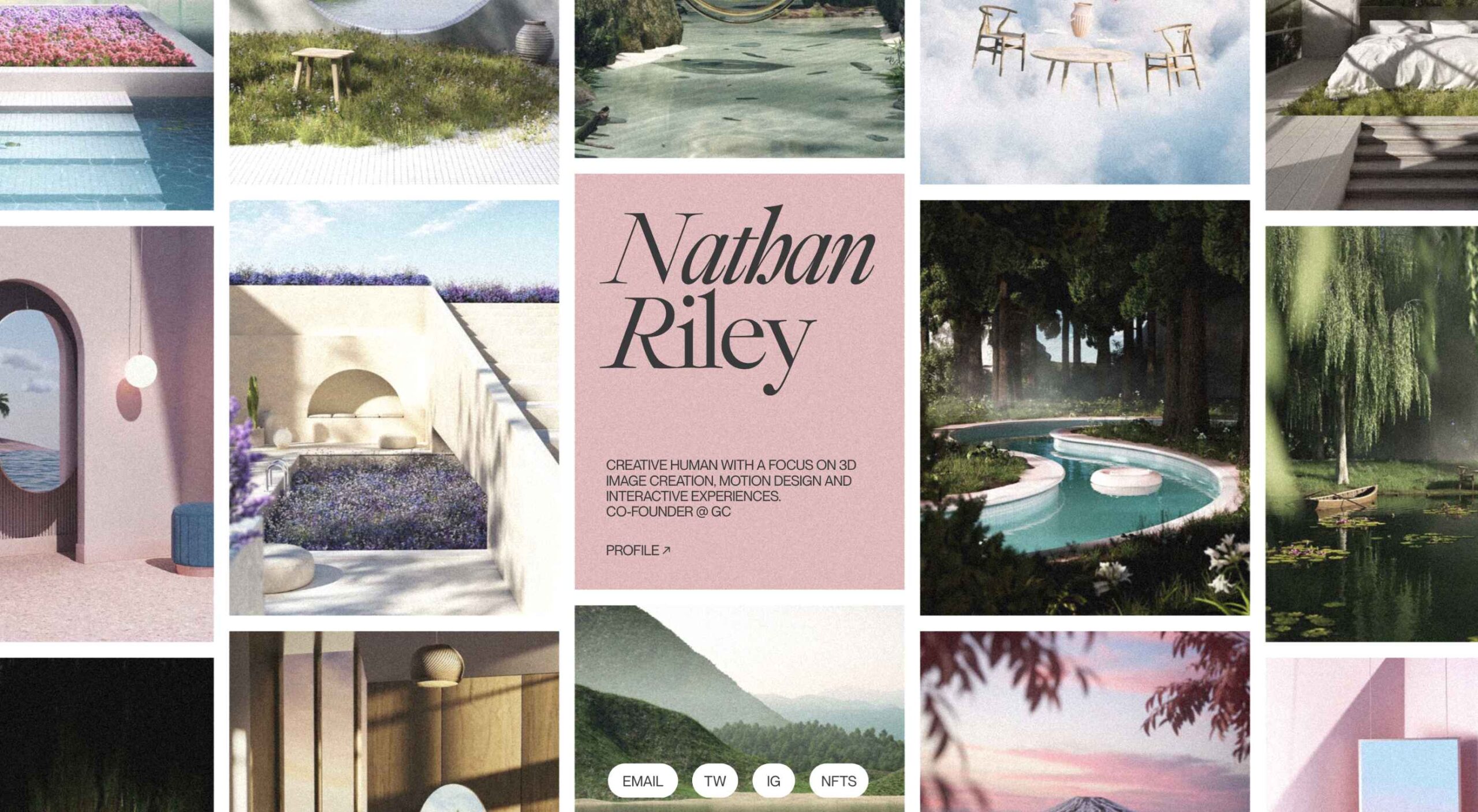
Nathan Riley
An excellent example of masonry combined with variable scrolling speeds creates tension in digital artist Nathan Riley’s portfolio.

Evi O. Studio
Sometimes the simplest things, like this full-screen image transition for Evi O. Studio’s portfolio, can be so well done it’s an absolute pleasure to scroll through.

Sundo
Sundo has created SMOTSpots – smart sunscreen dispensers for public areas. The tone of the site is suitably utilitarian with a soft edge.

Blue
The Blue Experience from Rossinavi Luxury Boat Builders is a pleasing immersive microsite showcasing their new hybrid-electric boats.

Cased in Time
This site is an excellent example of how to make a single product commerce site that doesn’t feel lacking in content.

Educated Guess
Educated Guess is a podcast for creatives by creatives. The accompanying website is pleasing to use, easy to navigate and allows the user to focus on the content.