I recently came across a cool effect known as glassmorphism in a Dribble shot. My first thought was I could quickly recreate it in a few minutes if I just use some emojis for the icons without wasting time on SVG-ing them.
I couldn’t have been more wrong about those “few minutes” — they ended up being days of furiously and frustratingly scratching this itch!
It turns out that, while there are resources on how to CSS such an effect, they all assume the very simple case where the overlay is rectangular or at most a rectangle with border-radius. However, getting a glassmorphism effect for irregular shapes like icons, whether these icons are emojis or proper SVGs, is a lot more complicated than I expected, so I thought it would be worth sharing the process, the traps I fell into and the things I learned along the way. And also the things I still don’t understand.
Why emojis?
Short answer: because SVG takes too much time. Long answer: because I lack the artistic sense of just drawing them in an image editor, but I’m familiar with the syntax enough such that I can often compact ready-made SVGs I find online to less than 10% of their original size. So, I cannot just use them as I find them on the internet — I have to redo the code to make it super clean and compact. And this takes time. A lot of time because it’s detail work.
And if all I want is to quickly code a menu concept with icons, I resort to using emojis, applying a filter on them in order to make them match the theme and that’s it! It’s what I did for this liquid tab bar interaction demo — those icons are all emojis! The smooth valley effect makes use of the mask compositing technique.

Alright, so this is going to be our starting point: using emojis for the icons.
The initial idea
My first thought was to stack the two pseudos (with emoji content) of the navigation links, slightly offset and rotate the bottom one with a transform so that they only partly overlap. Then, I’d make the top one semitransparent with an opacity value smaller than 1, set backdrop-filter: blur() on it, and that should be just about enough.
Now, having read the intro, you’ve probably figured out that didn’t go as planned, but let’s see what it looks like in code and what issues there are with it.
We generate the nav bar with the following Pug:
- let data = {
- home: { ico: '🏠', hue: 200 },
- notes: { ico: '🗒️', hue: 260 },
- activity: { ico: '🔔', hue: 320 },
- discovery: { ico: '🧭', hue: 30 }
- };
- let e = Object.entries(data);
- let n = e.length;
nav
- for(let i = 0; i > n; i++)
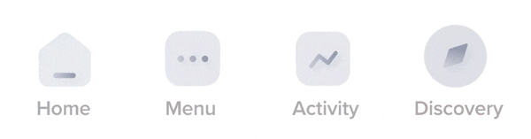
a(href='#' data-ico=e[i][1].ico style=`--hue: ${e[i][1].hue}deg`) #{e[i][0]}Which compiles to the HTML below:
<nav>
  <a href='#' data-ico='🏠' style='--hue: 200deg'>home</a>
  <a href='#' data-ico='🗒️' style='--hue: 260deg'>notes</a>
  <a href='#' data-ico='🔔' style='--hue: 320deg'>activity</a>
  <a href='#' data-ico='🧭' style='--hue: 30deg'>iscovery</a>
</nav>
We start with layout, making our elements grid items. We place the nav in the middle, give links explicit widths, put both pseudos for each link in the top cell (which pushes the link text content to the bottom cell) and middle-align the link text and pseudos.
body, nav, a { display: grid; }

body {
  margin: 0;
  height: 100vh;
}

nav {
  grid-auto-flow: column;
  place-self: center;
  padding: .75em 0 .375em;
}

a {
  width: 5em;
  text-align: center;

  &::before, &::after {
    grid-area: 1/ 1;
    content: attr(data-ico);
  }
}
Note that the look of the emojis is going to be different depending on the browser you’re using view the demos.
We pick a legible font, bump up its size, make the icons even bigger, set backgrounds, and a nicer color for each of the links (based on the --hue custom property in the style attribute of each):
body {
  /* same as before */
  background: #333;
}

nav {
  /* same as before */
  background: #fff;
  font: clamp(.625em, 5vw, 1.25em)/ 1.25 ubuntu, sans-serif;
}

a {
  /* same as before */
  color: hsl(var(--hue), 100%, 50%);
  text-decoration: none;

  &::before, &::after {
    /* same as before */
    font-size: 2.5em;
  }
}
Here’s where things start to get interesting because we start differentiating between the two emoji layers created with the link pseudos. We slightly move and rotate the ::before pseudo, make it monochrome with a sepia(1) filter, get it to the right hue, and bump up its contrast() — an oldie but goldie technique from Lea Verou. We also apply a filter: grayscale(1) on the ::after pseudo and make it semitransparent because, otherwise, we wouldn’t be able to see the other pseudo through it.
a {
  /* same as before */

  &::before {
    transform:
      translate(.375em, -.25em)
      rotate(22.5deg);
    filter:
      sepia(1)
      hue-rotate(calc(var(--hue) - 50deg))
      saturate(3);
  }

  &::after {
    opacity: .5;
    filter: grayscale(1);
  }
}
Hitting a wall
So far, so good… so what? The next step, which I foolishly thought would be the last when I got the idea to code this, involves setting a backdrop-filter: blur(5px) on the top (::after) layer.
Note that Firefox still needs the gfx.webrender.all and layout.css.backdrop-filter.enabled flags set to true in about:config in order for the backdrop-filter property to work.

backdrop-filter to work.Sadly, the result looks nothing like what I expected. We get a sort of overlay the size of the entire top icon bounding box, but the bottom icon isn’t really blurred.

backdrop-filter.However, I’m pretty sure I’ve played with backdrop-filter: blur() before and it worked, so what the hairy heck is going on here?

Getting to the root of the problem
Well, when you have no idea whatsoever why something doesn’t work, all you can do is take another working example, start adapting it to try to get the result you want… and see where it breaks!
So let’s see a simplified version of my older working demo. The HTML is just an article in a section. In the CSS, we first set some dimensions, then we set an image background on the section, and a semitransparent one on the article. Finally, we set the backdrop-filter property on the article.
section { background: url(cake.jpg) 50%/ cover; }

article {
  margin: 25vmin;
  height: 40vh;
  background: hsla(0, 0%, 97%, .25);
  backdrop-filter: blur(5px);
}
This works, but we don’t want our two layers nested in one another; we want them to be siblings. So, let’s make both layers article siblings, make them partly overlap and see if our glassmorphism effect still works.
<article class='base'></article>
<article class='grey'></article>
article { width: 66%; height: 40vh; }
.base { background: url(cake.jpg) 50%/ cover; }
.grey {
margin: -50% 0 0 33%;
background: hsla(0, 0%, 97%, .25);
backdrop-filter: blur(5px);
}
Everything still seems fine in Chrome and, for the most part, Firefox too. It’s just that the way blur() is handled around the edges in Firefox looks awkward and not what we want. And, based on the few images in the spec, I believe the Firefox result is also incorrect?
I suppose one fix for the Firefox problem in the case where our two layers sit on a solid background (white in this particular case) is to give the bottom layer (.base) a box-shadow with no offsets, no blur, and a spread radius that’s twice the blur radius we use for the backdrop-filter applied on the top layer (.grey). Sure enough, this fix seems to work in our particular case.
Things get a lot hairier if our two layers sit on an element with an image background that’s not fixed (in which case, we could use a layered backgrounds approach to solve the Firefox issue), but that’s not the case here, so we won’t get into it.
Still, let’s move on to the next step. We don’t want our two layers to be two square boxes, we want then to be emojis, which means we cannot ensure semitransparency for the top one using a hsla() background — we need to use opacity.
.grey {
  /* same as before */
  opacity: .25;
  background: hsl(0, 0%, 97%);
}
opacity instead of a hsla() background.It looks like we found the problem! For some reason, making the top layer semitransparent using opacity breaks the backdrop-filter effect in both Chrome and Firefox. Is that a bug? Is that what’s supposed to happen?
Bug or not?
MDN says the following in the very first paragraph on the backdrop-filter page:
Because it applies to everything behind the element, to see the effect you must make the element or its background at least partially transparent.
Unless I don’t understand the above sentence, this appears to suggest that opacity shouldn’t break the effect, even though it does in both Chrome and Firefox.
What about the spec? Well, the spec is a huge wall of text without many illustrations or interactive demos, written in a language that makes reading it about as appealing as sniffing a skunk’s scent glands. It contains this part, which I have a feeling might be relevant, but I’m unsure that I understand what it’s trying to say — that the opacity set on the top element that we also have the backdrop-filter on also gets applied on the sibling underneath it? If that’s the intended result, it surely isn’t happening in practice.
The effect of the backdrop-filter will not be visible unless some portion of element B is semi-transparent. Also note that any opacity applied to element B will be applied to the filtered backdrop image as well.
Trying random things
Whatever the spec may be saying, the fact remains: making the top layer semitransparent with the opacity property breaks the glassmorphism effect in both Chrome and Firefox. Is there any other way to make an emoji semitransparent? Well, we could try filter: opacity()!
At this point, I should probably be reporting whether this alternative works or not, but the reality is… I have no idea! I spent a couple of days around this step and got to check the test countless times in the meanwhile — sometimes it works, sometimes it doesn’t in the exact same browsers, wit different results depending on the time of day. I also asked on Twitter and got mixed answers. Just one of those moments when you can’t help but wonder whether some Halloween ghost isn’t haunting, scaring and scarring your code. For eternity!
It looks like all hope is gone, but let’s try just one more thing: replacing the rectangles with text, the top one being semitransparent with color: hsla(). We may be unable to get the cool emoji glassmorphism effect we were after, but maybe we can get such a result for plain text.
So we add text content to our article elements, drop their explicit sizing, bump up their font-size, adjust the margin that gives us partial overlap and, most importantly, replace the background declarations in the last working version with color ones. For accessibility reasons, we also set aria-hidden='true' on the bottom one.
<article class='base' aria-hidden='true'>Lion 🧡</article>
<article class='grey'>Lion 🖤</article>
article { font: 900 21vw/ 1 cursive; }
.base { color: #ff7a18; }
.grey {
margin: -.75em 0 0 .5em;
color: hsla(0, 0%, 50%, .25);
backdrop-filter: blur(5px);
}
There are couple of things to note here.
First, setting the color property to a value with a subunitary alpha also makes emojis semitransparent, not just plain text, both in Chrome and in Firefox! This is something I never knew before and I find absolutely mindblowing, given the other channels don’t influence emojis in any way.
Second, both Chrome and Firefox are blurring the entire area of the orange text and emoji that’s found underneath the bounding box of the top semitransparent grey layer, instead of just blurring what’s underneath the actual text. In Firefox, things look even worse due to that awkward sharp edge effect.
Even though the box blur is not what we want, I can’t help but think it does make sense since the spec does say the following:
[…] to create a “transparent” element that allows the full filtered backdrop image to be seen, you can use “background-color: transparent;”.
So let’s make a test to check what happens when the top layer is another non-rectangular shape that’s not text, but instead obtained with a background gradient, a clip-path or a mask!

In both Chrome and Firefox, the area underneath the entire box of the top layer gets blurred when the shape is obtained with background: gradient() which, as mentioned in the text case before, makes sense per the spec. However, Chrome respects the clip-path and mask shapes, while Firefox doesn’t. And, in this case, I really don’t know which is correct, though the Chrome result does make more sense to me.
Moving towards a Chrome solution
This result and a Twitter suggestion I got when I asked how to make the blur respect the text edges and not those of its bounding box led me to the next step for Chrome: applying a mask clipped to the text on the top layer (.grey). This solution doesn’t work in Firefox for two reasons: one, text is sadly a non-standard mask-clip value that only works in WebKit browsers and, two, as shown by the test above, masking doesn’t restrict the blur area to the shape created by the mask in Firefox anyway.
/* same as before */

.grey {
  /* same as before */
  -webkit-mask: linear-gradient(red, red) text; /* only works in WebKit browsers */
}
Alright, this actually looks like what we want, so we can say we’re heading in the right direction! However, here we’ve used an orange heart emoji for the bottom layer and a black heart emoji for the top semitransparent layer. Other generic emojis don’t have black and white versions, so my next idea was to initially make the two layers identical, then make the top one semitransparent and use filter: grayscale(1) on it.
article {
  color: hsla(25, 100%, 55%, var(--a, 1));
  font: 900 21vw/ 1.25 cursive;
}

.grey {
  --a: .25;
  margin: -1em 0 0 .5em;
  filter: grayscale(1);
  backdrop-filter: blur(5px);
  -webkit-mask: linear-gradient(red, red) text;
}
grayscale(1) filter.Well, that certainly had the effect we wanted on the top layer. Unfortunately, for some weird reason, it seems to have also affected the blurred area of the layer underneath. This moment is where to briefly consider throwing the laptop out the window… before getting the idea of adding yet another layer.
It would go like this: we have the base layer, just like we have so far, slightly offset from the other two above it. The middle layer is a “ghost” (transparent) one that has the backdrop-filter applied. And finally, the top one is semitransparent and gets the grayscale(1) filter.
body { display: grid; }

article {
  grid-area: 1/ 1;
  place-self: center;
  padding: .25em;
  color: hsla(25, 100%, 55%, var(--a, 1));
  font: 900 21vw/ 1.25 pacifico, z003, segoe script, comic sans ms, cursive;
}

.base { margin: -.5em 0 0 -.5em; }

.midl {
  --a: 0;
  backdrop-filter: blur(5px);
  -webkit-mask: linear-gradient(red, red) text;
}

.grey { filter: grayscale(1) opacity(.25) }
Now we’re getting somewhere! There’s just one more thing left to do: make the base layer monochrome!
/* same as before */

.base {
  margin: -.5em 0 0 -.5em;
  filter: sepia(1) hue-rotate(165deg) contrast(1.5);
}
Alright, this is the effect we want!
Getting to a Firefox solution
While coding the Chrome solution, I couldn’t help but think we may be able to pull off the same result in Firefox since Firefox is the only browser that supports the element() function. This function allows us to take an element and use it as a background for another element.
The idea is that the .base and .grey layers will have the same styles as in the Chrome version, while the middle layer will have a background that’s (via the element() function) a blurred version of our layers.
To make things easier, we start with just this blurred version and the middle layer.
<article id='blur' aria-hidden='true'>Lion 🦁</article>
<article class='midl'>Lion 🦁</article>
We absolutely position the blurred version (still keeping it in sight for now), make it monochrome and blur it and then use it as a background for .midl.
#blur {
  position: absolute;
  top: 2em; right: 0;
  margin: -.5em 0 0 -.5em;
  filter: sepia(1) hue-rotate(165deg) contrast(1.5) blur(5px);
}

.midl {
  --a: .5;
  background: -moz-element(#blur);
}
We’ve also made the text on the .midl element semitransparent so we can see the background through it. We’ll make it fully transparent eventually, but for now, we still want to see its position relative to the background.

#blur as a background.We can notice a one issue right away: while margin works to offset the actual #blur element, it does nothing for shifting its position as a background. In order to get such an effect, we need to use the transform property. This can also help us if we want a rotation or any other transform — as it can be seen below where we’ve replaced the margin with transform: rotate(-9deg).

transform: rotate() instead of margin on the #blur element.Alright, but we’re still sticking to just a translation for now:
#blur {
  /* same as before */
  transform: translate(-.25em, -.25em); /* replaced margin */
}
transform: translate() instead of margin on the #blur element.One thing to note here is that a bit of the blurred background gets cut off as it goes outside the limits of the middle layer’s padding-box. That doesn’t matter at this step anyway since our next move is to clip the background to the text area, but it’s good to just have that space since the .base layer is going to get translated just as far.

#blur background exceeds the limits of the padding-box on the .midl element.So, we’re going to bump up the padding by a little bit, even if, at this point, it makes absolutely no difference visually as we’re also setting background-clip: text on our .midl element.
article {
  /* same as before */
  padding: .5em;
}

#blur {
  position: absolute;
  bottom: 100vh;
  transform: translate(-.25em, -.25em);
  filter: sepia(1) hue-rotate(165deg) contrast(1.5) blur(5px);
}

.midl {
  --a: .1;
  background: -moz-element(#blur);
  background-clip: text;
}
We’ve also moved the #blur element out of sight and further reduced the alpha of the .midl element’s color, as we want a better view at the background through the text. We’re not making it fully transparent, but still keeping it visible for now just so we know what area it covers.

.midl element’s background to text.The next step is to add the .base element with pretty much the same styles as it had in the Chrome case, only replacing the margin with a transform.
<article id='blur' aria-hidden='true'>Lion 🦁</article>
<article class='base' aria-hidden='true'>Lion 🦁</article>
<article class='midl'>Lion 🦁</article>
#blur {
position: absolute;
bottom: 100vh;
transform: translate(-.25em, -.25em);
filter: sepia(1) hue-rotate(165deg) contrast(1.5) blur(5px);
}
.base {
transform: translate(-.25em, -.25em);
filter: sepia(1) hue-rotate(165deg) contrast(1.5);
}Since a part of these styles are common, we can also add the .base class on our blurred element #blur in order to avoid duplication and reduce the amount of code we write.
<article id='blur' class='base' aria-hidden='true'>Lion 🦁</article>
<article class='base' aria-hidden='true'>Lion 🦁</article>
<article class='midl'>Lion 🦁</article>
#blur {
--r: 5px;
position: absolute;
bottom: 100vh;
}
.base {
transform: translate(-.25em, -.25em);
filter: sepia(1) hue-rotate(165deg) contrast(1.5) blur(var(--r, 0));
}
.base layer.We have a different problem here. Since the .base layer has a transform, it’s now on top of the .midl layer in spite of DOM order. The simplest fix? Add z-index: 2 on the .midl element!

.base is underneath .midl.We still have another, slightly more subtle problem: the .base element is still visible underneath the semitransparent parts of the blurred background we’ve set on the .midl element. We don’t want to see the sharp edges of the .base layer text underneath, but we are because blurring causes pixels close to the edge to become semitransparent.

Depending on what kind of background we have on the parent of our text layers, this is a problem that can be solved with a little or a lot of effort.
If we only have a solid background, the problem gets solved by setting the background-color on our .midl element to that same value. Fortunately, this happens to be our case, so we won’t go into discussing the other scenario. Maybe in another article.
.midl {
/* same as before */
background: -moz-element(#blur) #fff;
background-clip: text;
}
.base layer isn’t visible through the background of the .midl one.We’re getting close to a nice result in Firefox! All that’s left to do is add the top .grey layer with the exact same styles as in the Chrome version!
.grey { filter: grayscale(1) opacity(.25); }Sadly, doing this doesn’t produce the result we want, which is something that’s really obvious if we also make the middle layer text fully transparent (by zeroing its alpha --a: 0) so that we only see its background (which uses the blurred element #blur on top of solid white) clipped to the text area:

.grey layer.The problem is we cannot see the .grey layer! Due to setting z-index: 2 on it, the middle layer .midl is now above what should be the top layer (the .grey one), in spite of the DOM order. The fix? Set z-index: 3 on the .grey layer!
.grey {
z-index: 3;
filter: grayscale(1) opacity(.25);
}I’m not really fond of giving out z-index layer after layer, but hey, it’s low effort and it works! We now have a nice Firefox solution:

Combining our solutions into a cross-browser one
We start with the Firefox code because there’s just more of it:
<article id='blur' class='base' aria-hidden='true'>Lion 🦁</article>
<article class='base' aria-hidden='true'>Lion 🦁</article>
<article class='midl' aria-hidden='true'>Lion 🦁</article>
<article class='grey'>Lion 🦁</article>body { display: grid; }
article {
grid-area: 1/ 1;
place-self: center;
padding: .5em;
color: hsla(25, 100%, 55%, var(--a, 1));
font: 900 21vw/ 1.25 cursive;
}
#blur {
  --r: 5px;
  position: absolute;
  bottom: 100vh;
}

.base {
  transform: translate(-.25em, -.25em);
  filter: sepia(1) hue-rotate(165deg) contrast(1.5) blur(var(--r, 0));
}
.midl {
--a: 0;
z-index: 2;
background: -moz-element(#blur) #fff;
background-clip: text;
}
.grey {
  z-index: 3;
  filter: grayscale(1) opacity(.25);
}The extra z-index declarations don’t impact the result in Chrome and neither does the out-of-sight #blur element. The only things that this is missing in order for this to work in Chrome are the backdrop-filter and the mask declarations on the .midl element:
backdrop-filter: blur(5px);
-webkit-mask: linear-gradient(red, red) text;
Since we don’t want the backdrop-filter to get applied in Firefox, nor do we want the background to get applied in Chrome, we use @supports:
$r: 5px;

/* same as before */

#blur {
  /* same as before */
  --r: #{$r};
}

.midl {
  --a: 0;
  z-index: 2;
  /* need to reset inside @supports so it doesn't get applied in Firefox */
  backdrop-filter: blur($r);
  /* invalid value in Firefox, not applied anyway, no need to reset */
  -webkit-mask: linear-gradient(red, red) text;

  @supports (background: -moz-element(#blur)) { /* for Firefox */
    background: -moz-element(#blur) #fff;
    background-clip: text;
    backdrop-filter: none;
  }
}
This gives us a cross-browser solution!

While the result isn’t the same in the two browsers, it’s still pretty similar and good enough for me.
What about one-elementing our solution?
Sadly, that’s impossible.
First off, the Firefox solution requires us to have at least two elements since we use one (referenced by its id) as a background for another.
Second, while the first thought with the remaining three layers (which are the only ones we need for the Chrome solution anyway) is that one of them could be the actual element and the other two its pseudos, it’s not so simple in this particular case.
For the Chrome solution, each of the layers has at least one property that also irreversibly impacts any children and any pseudos it may have. For the .base and .grey layers, that’s the filter property. For the middle layer, that’s the mask property.
So while it’s not pretty to have all those elements, it looks like we don’t have a better solution if we want the glassmorphism effect to work on emojis too.
If we only want the glassmorphism effect on plain text — no emojis in the picture — this can be achieved with just two elements, out of which only one is needed for the Chrome solution. The other one is the #blur element, which we only need in Firefox.
<article id='blur'>Blood</article>
<article class='text' aria-hidden='true' data-text='Blood'></article>
We use the two pseudos of the .text element to create the base layer (with the ::before) and a combination of the other two layers (with the ::after). What helps us here is that, with emojis out of the picture, we don’t need filter: grayscale(1), but instead we can control the saturation component of the color value.
These two pseudos are stacked one on top of the other, with the bottom one (::before) offset by the same amount and having the same color as the #blur element. This color value depends on a flag, --f, that helps us control both the saturation and the alpha. For both the #blur element and the ::before pseudo (--f: 1), the saturation is 100% and the alpha is 1. For the ::after pseudo (--f: 0), the saturation is 0% and the alpha is .25.
$r: 5px;

%text { // used by #blur and both .text pseudos
  --f: 1;
  grid-area: 1/ 1; // stack pseudos, ignored for absolutely positioned #base
  padding: .5em;
  color: hsla(345, calc(var(--f)*100%), 55%, calc(.25 + .75*var(--f)));
  content: attr(data-text);
}

article { font: 900 21vw/ 1.25 cursive }

#blur {
  position: absolute;
  bottom: 100vh;
  filter: blur($r);
}

#blur, .text::before {
  transform: translate(-.125em, -.125em);
  @extend %text;
}

.text {
  display: grid;

  &::after {
    --f: 0;
    @extend %text;
    z-index: 2;
    backdrop-filter: blur($r);
    -webkit-mask: linear-gradient(red, red) text;

    @supports (background: -moz-element(#blur)) {
      background: -moz-element(#blur) #fff;
      background-clip: text;
      backdrop-filter: none;
    }
  }
}Applying the cross-browser solution to our use case
The good news here is our particular use case where we only have the glassmorphism effect on the link icon (not on the entire link including the text) actually simplifies things a tiny little bit.
We use the following Pug to generate the structure:
- let data = {
-   home: { ico: '🏠', hue: 200 },
-   notes: { ico: '🗒️', hue: 260 },
-   activity: { ico: '🔔', hue: 320 },
-   discovery: { ico: '🧭', hue: 30 }
- };
- let e = Object.entries(data);
- let n = e.length;

nav
  - for(let i = 0; i < n; i++)
    - let ico = e[i][1].ico;
    a.item(href='#' style=`--hue: ${e[i][1].hue}deg`)
      span.icon.tint(id=`blur${i}` aria-hidden='true') #{ico}
      span.icon.tint(aria-hidden='true') #{ico}
      span.icon.midl(aria-hidden='true' style=`background-image: -moz-element(#blur${i})`) #{ico}
      span.icon.grey(aria-hidden='true') #{ico}
      | #{e[i][0]}
Which produces an HTML structure like the one below:
<nav>
  <a class='item' href='#' style='--hue: 200deg'>
    <span class='icon tint' id='blur0' aria-hidden='true'>🏠</span>
    <span class='icon tint' aria-hidden='true'>🏠</span>
    <span class='icon midl' aria-hidden='true' style='background-image: -moz-element(#blur0)'>🏠</span>
    <span class='icon grey' aria-hidden='true'>🏠</span>
    home
  </a>
  <!-- the other nav items -->
</nav>
We could probably replace a part of those spans with pseudos, but I feel it’s more consistent and easier like this, so a span sandwich it is!
One very important thing to notice is that we have a different blurred icon layer for each of the items (because each and every item has its own icon), so we set the background of the .midl element to it in the style attribute. Doing things this way allows us to avoid making any changes to the CSS file if we add or remove entries from the data object (thus changing the number of menu items).
We have almost the same layout and prettified styles we had when we first CSS-ed the nav bar. The only difference is that now we don’t have pseudos in the top cell of an item’s grid; we have the spans:
span {
  grid-area: 1/ 1; /* stack all emojis on top of one another */
  font-size: 4em; /* bump up emoji size */
}
For the emoji icon layers themselves, we also don’t need to make many changes from the cross-browser version we got a bit earlier, though there are a few lttle ones.
First off, we use the transform and filter chains we picked initially when we were using the link pseudos instead of spans. We also don’t need the color: hsla() declaration on the span layers any more since, given that we only have emojis here, it’s only the alpha channel that matters. The default, which is preserved for the .base and .grey layers, is 1. So, instead of setting a color value where only the alpha, --a, channel matters and we change that to 0 on the .midl layer, we directly set color: transparent there. We also only need to set the background-color on the .midl element in the Firefox case as we’ve already set the background-image in the style attribute. This leads to the following adaptation of the solution:
.base { /* mono emoji version */
  transform: translate(.375em, -.25em) rotate(22.5deg);
  filter: sepia(1) hue-rotate(var(--hue)) saturate(3) blur(var(--r, 0));
}

.midl { /* middle, transparent emoji version */
  color: transparent; /* so it's not visible */
  backdrop-filter: blur(5px);
  -webkit-mask: linear-gradient(red 0 0) text;

  @supports (background: -moz-element(#b)) {
    background-color: #fff;
    background-clip: text;
    backdrop-filter: none;
  }
}
And that’s it — we have a nice icon glassmorphism effect for this nav bar!

There’s just one more thing to take care of — we don’t want this effect at all times; only on :hover or :focus states. So, we’re going to use a flag, --hl, which is 0 in the normal state, and 1 in the :hover or :focus state in order to control the opacity and transform values of the .base spans. This is a technique I’ve detailed in an earlier article.
$t: .3s;

a {
  /* same as before */
  --hl: 0;
  color: hsl(var(--hue), calc(var(--hl)*100%), 65%);
  transition: color $t;

  &:hover, &:focus { --hl: 1; }
}

.base {
  transform:
    translate(calc(var(--hl)*.375em), calc(var(--hl)*-.25em))
    rotate(calc(var(--hl)*22.5deg));
  opacity: var(--hl);
  transition: transform $t, opacity $t;
}
The result can be seen in the interactive demo below when the icons are hovered or focused.
What about using SVG icons?
I naturally asked myself this question after all it took to get the CSS emoji version working. Wouldn’t the plain SVG way make more sense than a span sandwich, and wouldn’t it be simpler? Well, while it does make more sense, especially since we don’t have emojis for everything, it’s sadly not less code and it’s not any simpler either.
But we’ll get into details about that in another article!
The post Icon Glassmorphism Effect in CSS appeared first on CSS-Tricks. You can support CSS-Tricks by being an MVP Supporter.